Moni's Puff Puff: Full branding
Project Summary: Branding for Moni's Puff Puff
Client: Moni's Puff Puff
Slogan: "Snack Happy, Snack Moni"
Overview: Moni's Puff Puff is a beloved West African dessert snack business with a well-loved product but lacking a distinct brand identity. The client, Monica Bentil, had a tried-and-tested recipe for puff puff but needed a cohesive brand name, logo, and visual identity to take her business to the next level.
Objectives:
-
Create a memorable and culturally resonant brand name.
-
Develop a logo that encapsulates the essence of the product and Monica’s heritage.
-
Craft a visual identity that is inviting, warm, and recognisable.
-
Establish a strong brand presence that can support future product expansions.
Approach:
-
Brand Name: After thorough research and brainstorming, the name "Moni's Puff Puff" was selected. "Moni," a short form of Monica, also resonates with the word "money," adding a playful twist. "Moni" evokes wealth and enjoyment, appealing to a wide audience.
-
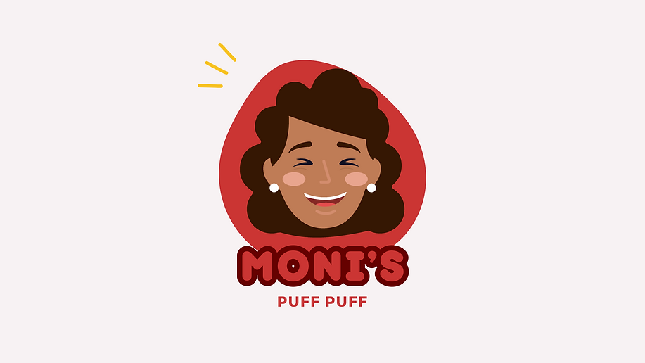
Logo Design: The logo features a bold, red, free-forming circle symbolising the traditional shape of puff puff. This circle conveys the idea that each puff puff, like us, is bold and unique. A cartooned version of Monica, complete with her unforgettable signature smile and prominent cheeks, adds a personal and friendly touch.
-
Typography and Colours: The chosen font in red and burgundy with rounded edges conveys softness and warmth, making the brand approachable and inviting. The colour palette is bright and bold, including red as a primary colour, along with dusty muted pinks, yellows, yolk, and a touch of orange to enhance the visual appeal.
-
Slogan: "Snack Happy, Snack Moni" was crafted to emphasise the joy and satisfaction derived from enjoying Moni's Puff Puff.
Results: The branding successfully transformed Moni's Puff Puff from a nameless snack to a recognisable and loved brand. The new identity not only highlighted the unique qualities of Monica’s puff puff but also allowed for future product expansion under the Moni brand. The cohesive visual identity and memorable slogan helped establish a strong market presence and enhanced customer connection.
This project showcases the power of strategic branding in elevating a beloved but unbranded product into a thriving business with a distinct and appealing identity.
.png)